Origen: Psychd: A new user psychology framework for increasing funnel conversion (Guest Post) at andrewchen

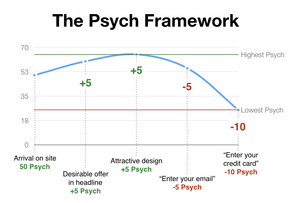
Every element of a webpage either inspires us by giving us more units of Psych or overwhelms us by depleting our existing store of Psych.
…
A user at 100 Psych is maximally committed to their current experience, does not need further motivation, and will overcome most challenges. For example, a person who needs to file their taxes tonight will do whatever it takes to download their W2 from their company’s payroll site. They’ll complete a forgotten password step, suffer through a poor interface they’ve never used before, and read through confusing numbers in order to get their taxes done in time.
A user at 0 Psych is exhausted and disinterested, to the point of abandoning their current experience. For example, a person accidentally clicking on an ad who realizes they’ve ended up on a scam site will have no motivation to continue and will bounce.
…
1. Assess initial Psych
2. Psych on the landing page
3. Enter personal info
4. Interact with product
5. Enter payment information
…
But optimizing Psych isn’t just a matter of removing clicks and reducing text. In some cases, more detailed forms or copy can help by decreasing the cognitive load on making the decision — even though it’s technically more effort. For example, including more information about security and money-back guarantees can overcome trust barriers and alleviate fears for big purchases.
…
Airbnb does a good job of loading up the page with +Psych elements because they know they’re asking a lot of the user:
- “Earn money? Yes please.” → +10 Psych
- “I can rent out an entire place, or a room, or just a couch? Then there probably is something for me.” → +5 Psych
- “$741 weekly average… higher than I thought.” → +10 Psych
- “Host insurance, and a $1M guarantee that protects my stuff… ok phew.” → +4 Psych
